Wayfinding and signage are essential elements for creating an enjoyable, positive atmosphere for any visitor navigating your venue — be it event staff, concert goers, or sports fans. But the best wayfinding systems are about more than signage, labeling a location, or creating a clever design.
It’s not enough to just tell people where to go or where they are. They need to be reminded that where they are is truly special and unique through every touchpoint at your venue. The right wayfinding and signage can do just that.
Do more than simply showing someone where to go by providing memorable moments that enhance your venue’s event experience. Let’s look at how you can integrate thoughtful wayfinding into your venue with a custom solution that makes a lasting impression.
Go Beyond Location and Navigation With Imagination
Making the most out of your wayfinding and signage allows you to distinguish your venue from the cookie-cutter designs of concrete bowls and multi-use municipal facilities from the past. This is an opportunity to remind users at every turn that they have arrived at their destination.
As an example, a sports stadium’s wayfinding could incorporate elements of the team’s logo, colors, and imagery to create a cohesive and memorable experience. Signage might highlight the history of the franchise, feature local landmarks, call out unique architectural features of the venue, or help fans find their way to must-see spots like the team’s hall of fame exhibit.
Some other creative approaches to effective wayfinding and signage include:
- Incorporating creative theming or branding elements into directional signage to make it more visually engaging and memorable
- Using interactive digital displays or augmented reality experiences to help visitors explore the venue and discover unique points of interest
- Highlighting your venue’s history, architecture or other distinguishing features through interpretive signage and graphics
- Providing intuitive wayfinding cues like distinctive vantage points, color-coding, or easily recognizable symbols to help orient visitors
- Carefully considering the placement, lighting, and visibility of signs to ensure they are easy to read and follow
When you look outside the usual arrows and icons, you can unlock new potential within your facility with a wayfinding portfolio that imprints on everyone who comes through the turnstiles.
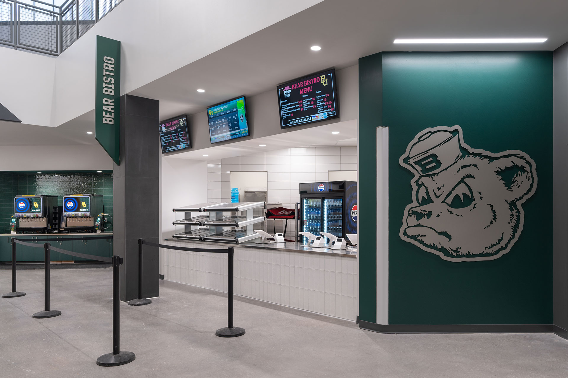
Embracing the Baylor font, brand colors and vintage bear logo make this concession stand a great example of clean modern signage and placemaking at Baylor’s Foster Pavilion.
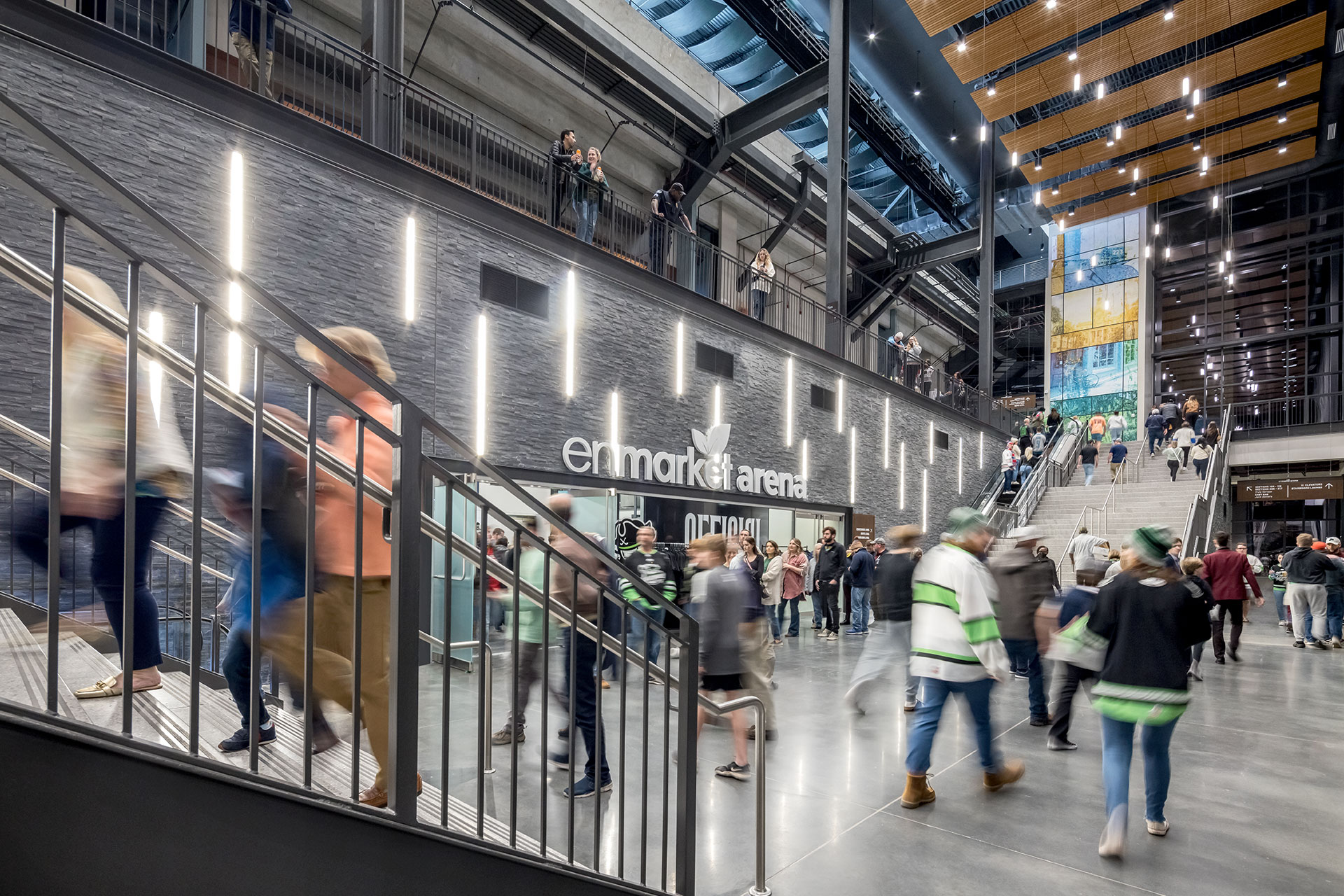
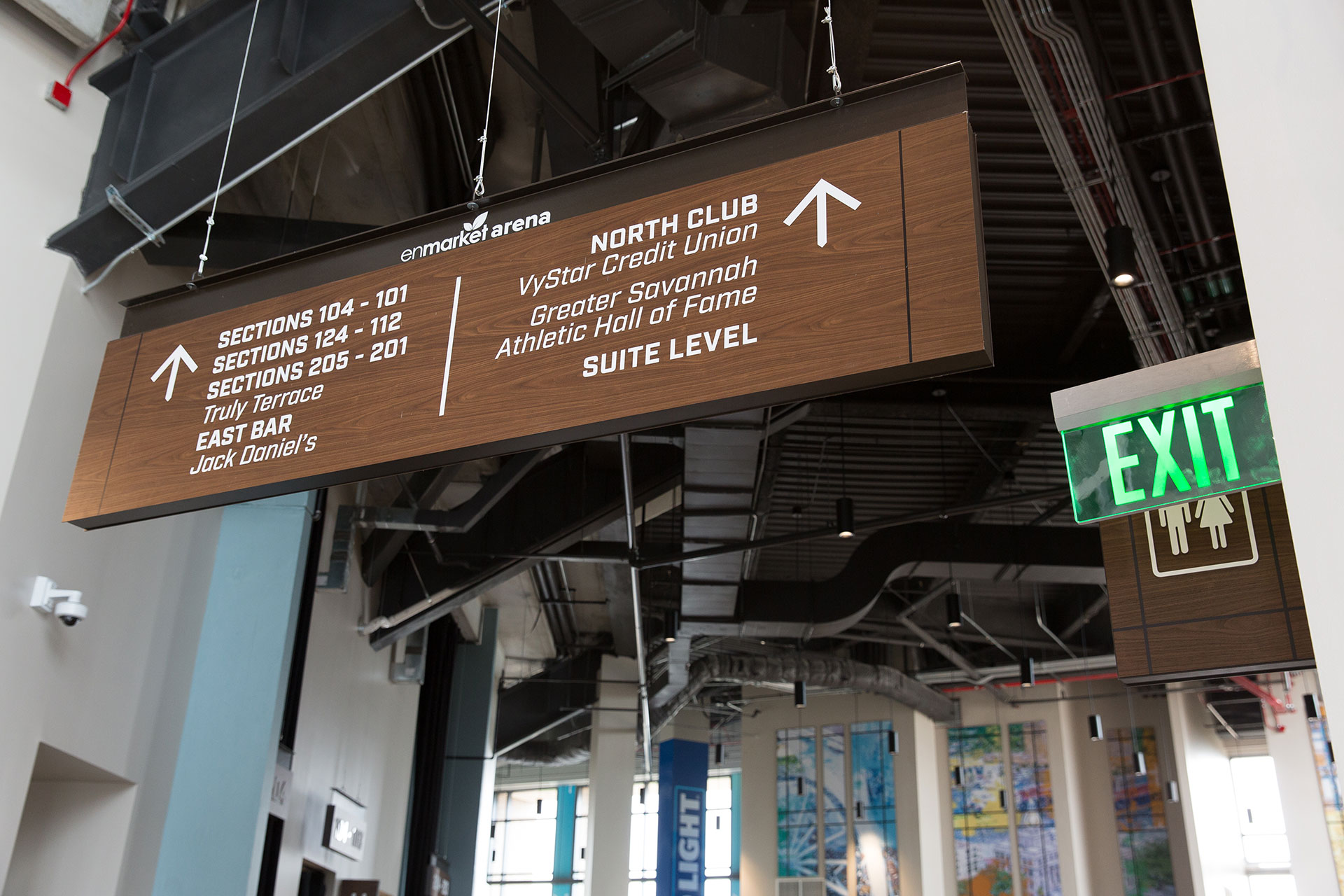
The signage system at Savannah’s new EnMarket Arena speaks to the industrial tone set by the architecture and reflects the Canal District location.
A Comprehensive Approach to Creating Meaningful Wayfinding
At Jack Porter, our objective is to create a successful wayfinding system for your venue — not just cranking out run-of-the-mill signage. Our approach to discovery focuses on identifying the distinguishing features of your venue’s location along with your team’s brand identity, history, and other unique attributes.
This holistic process allows us to work closely with you to create strategic, well-planned systems that provide all the necessary visual cues for navigating your facility, integrating and complementing the architecture of the building, and reinforcing the brands represented within your space.
By working to discover who you are as an organization, what you aspire to be, and how you want users to experience your facility, we can design the right wayfinding and signage to help you get there.
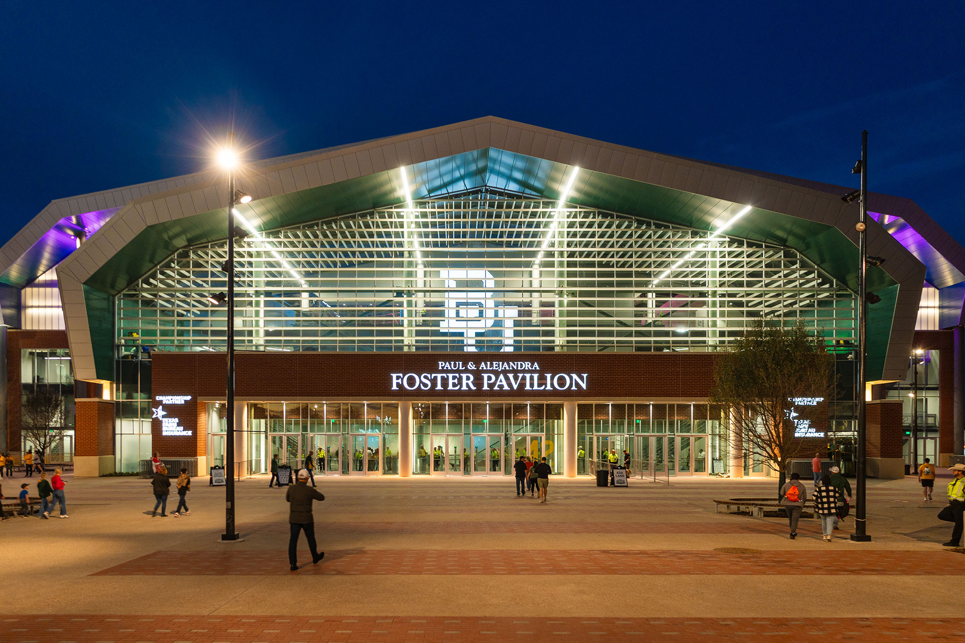
Hierarchy is key in designing an effective, wholistic signage system. This example from Baylor’s Foster Pavilion is a great example of incorporating the brand, venue name, donor recognition and sponsor recognition, while providing a unified look and working within the architecture.
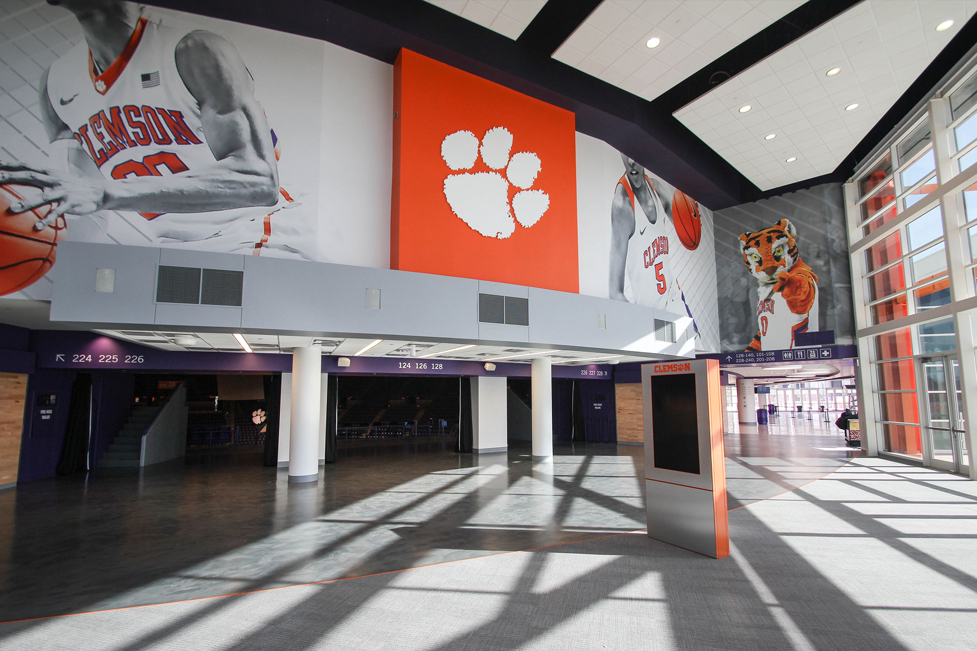
Signage should be as simple as it can be while doing its job. At Clemson’s Littlejohn, purple soffits provided the perfect surface to use for concourse wayfinding. Bold, larger than life graphics punch up the main vomitories providing valuable placemaking. The signage, graphics and branding are all working together visually and on brand.
Give Your Users an Experience That Will Stick With Them
This approach successfully and unobtrusively helps guide spectators throughout their visit and enhances the overall value of the event experience at your venue, making it a destination they love to return to over and over again.
If you’d like to discuss any upcoming plans for improving the wayfinding and signage in your facility, we’d love to hear from you.
